
SVG and its linearGradient element allow to achieve similar results to those obtained with CSS’s linear-gradient() function. A great benefit of using SVG is the possibility to create it using external graphic tools and then simply embedding in HTML. Once embedded, JS or CSS can be applied to it! In this post I bring back plenty of examples from CSS Linear Gradient post and try to reproduce the same effect with SVG.
Youtube Video – CSS vs SVG Linear Gradient
Demo and code (tl;dr)
See the Pen Untitled by Artur Karczmarczyk (@arturkarczmarczyk) on CodePen.
SVG linearGradient Basic Usage
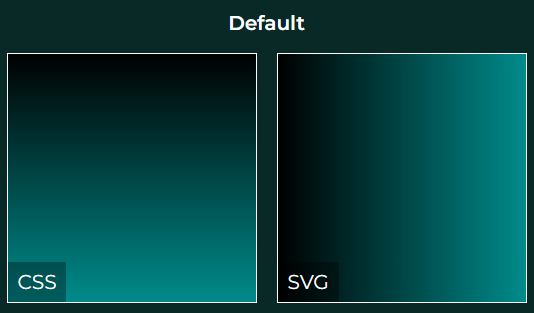
Let’s jump right into the code. To create a basic linear gradient in SVG, simply use linearGradient element. This element needs to be specified in the defs (definitions) tag. Once the linear gradient is specified, you need to give it an id. Later you can reuse this linear gradient as a fill of any element using url(‘#my-gradient-id’) syntax. See the sample code:
<svg viewBox="0 0 100 100">
    <defs>
        <linearGradient id="gradientDefault">
            <stop offset="0%" stop-color="black" />
            <stop offset="100%" stop-color="darkcyan" />
        </linearGradient>
    </defs>
    <rect width="100" height="100" fill="url('#gradientDefault')" />
</svg>
Effect:
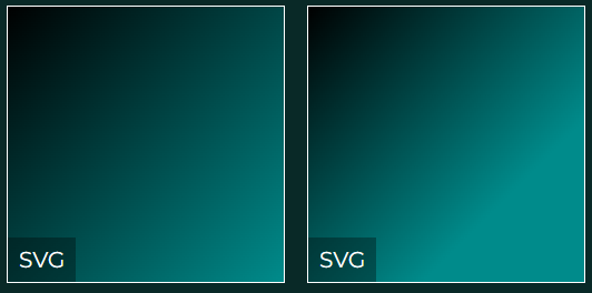
How to change direction of the SVG linearGradient?
Changing the default direction of the SVG linear gradient is simple. There are 2 options how to achieve that – either by setting the x1,y1 and x2,y2 points of the linear gradient, or by using CSS rotate() transform:
<svg viewBox="0 0 100 100">
    <defs>
        <linearGradient id="gradientXY" x1="0" y1="0" x2="100%" y2="100%">
            <stop offset="0%" stop-color="black" />
            <stop offset="100%" stop-color="darkcyan" />
        </linearGradient>
    </defs>
    <rect width="100" height="100" fill="url('#gradientXY')" />
</svg>

<svg viewBox="0 0 100 100">
    <defs>
        <linearGradient id="gradientRotate" style="transform: rotate(45deg);">
            <stop offset="0%" stop-color="black" />
            <stop offset="100%" stop-color="darkcyan" />
        </linearGradient>
    </defs>
    <rect width="100" height="100" fill="url('#gradientRotate')" />
</svg>
And here’s the effect:
For a very detailed explanation how and why it works – see this fragment of the YT video.
Hint Midpoint Position in SVG Linear Gradient
Unfortunately, there isn’t an easy way to hint the midpoint position in SVG. However, when you open any graphic tools, it does have this feature!
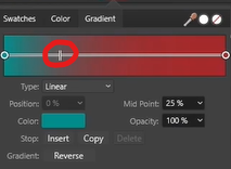
It’s great that SVG is an open XML format. It is very simple to export anything gradient we produce in the graphic software and then see how it produces the SVG. It turns out that for midpoint position hint in SVG linear gradient, a trick is used – additional color stops are added:
<svg viewBox="0 0 100 100">
    <defs>
        <linearGradient id="gradientMidpoint">
            <stop offset="0%" stop-color="darkcyan" />
            <!-- two stops need to be added - graphic tool needed -->
            <stop offset="0.2" stop-color="#416565"/>
            <stop offset="0.42" stop-color="#853D3D"/>

            <stop offset="100%" stop-color="brown" />
        </linearGradient>
    </defs>
    <rect width="100" height="100" fill="url('#gradientMidpoint')" />
</svg>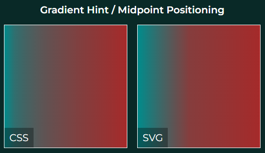
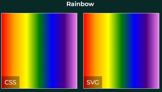
Multiple Gradient Colors
In order to add additional colors to your SVG linear gradient, all you need to do is add more stop elements within the gradient definition. At each stop you can specify both color and offset, either in 0-100% or 0.0-1.0 notation, to specify where the stop color should be:
<svg viewBox="0 0 100 100">
    <defs>
        <linearGradient id="gradientRainbow">
            <stop offset="0%" stop-color="red" />
            <stop offset="16%" stop-color="orange" />
            <stop offset="33%" stop-color="yellow" />
            <stop offset="50%" stop-color="green" />
            <stop offset="67%" stop-color="blue" />
            <stop offset="83%" stop-color="indigo" />
            <stop offset="100%" stop-color="violet" />
        </linearGradient>
    </defs>
    <rect width="100" height="100" fill="url('#gradientRainbow')" />
</svg>
This produces now a 7-color rainbow, same as with CSS:
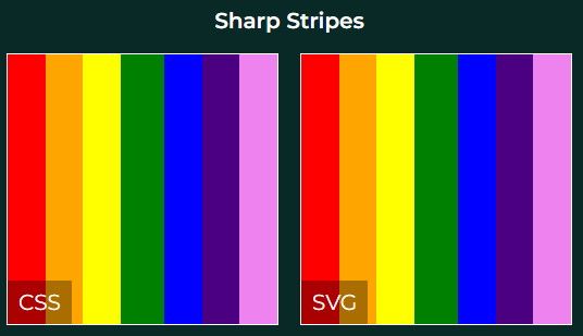
We can add even more color stops, to force sharp stripes. Just specify the start and stop offset of each color, and make sure there is no space between colors. For example, orange starts at 14% and ends at 28%, and yellow follows immediately at 28% to 42%, followed by green etc.:
<svg viewBox="0 0 100 100">
    <defs>
        <linearGradient id="gradientRainbowStripes">
            <stop offset="14%" stop-color="red" />
            <stop offset="14%" stop-color="orange" />
            <stop offset="28%" stop-color="orange" />
            <stop offset="28%" stop-color="yellow" />
            <stop offset="42%" stop-color="yellow" />
            <stop offset="42%" stop-color="green" />
            <stop offset="58%" stop-color="green" />
            <stop offset="58%" stop-color="blue" />
            <stop offset="72%" stop-color="blue" />
            <stop offset="72%" stop-color="indigo" />
            <stop offset="86%" stop-color="indigo" />
            <stop offset="86%" stop-color="violet" />
            <stop offset="100%" stop-color="violet" />
        </linearGradient>
    </defs>
    <rect width="100" height="100" fill="url('#gradientRainbowStripes')" />
</svg>
This results in 7 sharp stripes:
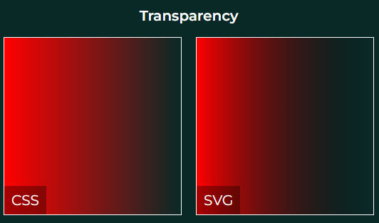
Transparency in SVG linear gradient
There are 2 approaches for adding transparency in SVG linear gradients. The first one is by just using transparent color – either transparent keyword, or using hexadecimal value including alpha channel, e.g. #FF000000 (4 pairs RGBA instead of 3 pairs RGB):
<svg viewBox="0 0 100 100">
    <defs>
        <linearGradient id="gradientTransparent">
            <stop offset="0%" stop-color="red" />
            <stop offset="100%" stop-color="transparent" />
        </linearGradient>
    </defs>
    <rect width="100" height="100" fill="url('#gradientTransparent')" />
</svg>
The second option is to use a stop-opacity attribute of the stop element:
<svg viewBox="0 0 100 100">
    <defs>
        <linearGradient id="gradientTransparent">
            <stop offset="0%" stop-color="red" stop-opacity="1" />
            <stop offset="100%" stop-color="red" stop-opacity="0" />
        </linearGradient>
    </defs>
    <rect width="100" height="100" fill="url('#gradientTransparent')" />
</svg>
In both cases the effect will be the same:
How to mix multiple SVG linear gradients in layers?
It is possible to overlay one linear gradient over another, with semi-transparent gradients, to obtain an effect of mixing gradients. Here is what we achieved with CSS:
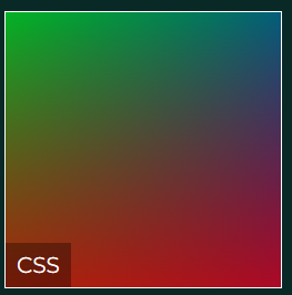
A single linearGradient SVG element cannot have information on many gradients. However, we can put multiple rectangle elements one over another:
<svg viewBox="0 0 100 100">
    <defs>
        <linearGradient id="gradientLayersRed" x1="0" y1="100%" x2="0" y2="0">
            <stop offset="0%" stop-color="red" stop-opacity="67%" />
            <stop offset="100%" stop-color="red" stop-opacity="0%"/>
        </linearGradient>
        <linearGradient id="gradientLayersGreen" x1="0" y1="0" x2="100%" y2="100%">
            <stop offset="0%" stop-color="green" stop-opacity="67%" />
            <stop offset="100%" stop-color="green" stop-opacity="0%"/>
        </linearGradient>
        <linearGradient id="gradientLayersBlue" x1="100%" y1="0" x2="0" y2="100%">
            <stop offset="0%" stop-color="blue" stop-opacity="67%" />
            <stop offset="100%" stop-color="blue" stop-opacity="0%"/>
        </linearGradient>
    </defs>
    <rect width="100" height="100" fill="url('#gradientLayersRed')" />
    <rect width="100" height="100" fill="url('#gradientLayersGreen')" />
    <rect width="100" height="100" fill="url('#gradientLayersBlue')" />
</svg>
In the code we have 3 gradients – red, green and blue – directed to top, to bottom right and to bottom left. Then we have 3 rectangles covering one another, each having different gradient assigned. Because the gradients are semi-transparent, the bottom rectangles are visible from below the top ones. Note, however, that the obtained effect is different than with CSS, and the order of rectangles does matter:
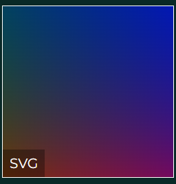
Repeating Linear Gradient
Finally, in this section we want to create a repeating linear gradient pattern:
This is very simple. You need to set x1,y1 and x2,y2 points of the gradient to take less than 100% of your rectangle, and then simply apply a spreadMethod attribute of the gradient to repeat:
<svg viewBox="0 0 100 100">
    <defs>
        <linearGradient id="gradientRepeated" x1="0" y1="0" x2="20%" y2="0" spreadMethod="repeat">
            <stop offset="0%" stop-color="black" />
            <stop offset="50%" stop-color="darkcyan" />
            <stop offset="100%" stop-color="black" />
        </linearGradient>
    </defs>
    <rect width="100" height="100" fill="url('#gradientRepeated')" />
</svg>
Summary
In this post I showed you multiple ideas how to use SVG linear gradients. I was able to reproduce majority of the ideas from the CSS linear-gradient() blog post. This is an interesting alternative to keeping things in CSS, especially that you can use software like Adobe Illustrator or Affinity Designer or Inkscape to produce custom fancy gradients. I encourage you to check out the Youtube video of SVG vs CSS linear gradients. In the video I show you all the ideas above in detail, step by step!
If you’d like to learn more on HTML, CSS and LESS in a structured, no-nonsense, hands-on manner, try my Udemy HTML & CSS 2022: Hands-on No-nonsense Guide!
Leave a Reply