CSS linear-gradient() and repeating-linear-gradient() functions allow to compute amazing gradients without need to use external graphics software. In this post I will show you multiple ideas how to use CSS linear gradient and create gradient background CSS.
Youtube Video – CSS Linear Gradient
Demo and code (tl;dr)
See the Pen CSS Linear Gradient | linear-gradient() by Artur Karczmarczyk (@arturkarczmarczyk) on CodePen.
CSS linear-gradient() basic usage
Let’s jump right into the code. To create a basic gradient, simply use linear-gradient function and provide two colors. Here I am using the color names, but you can use everything that is available for colors, so you can use hexadecimal values or RGB etc.
div {
  background: linear-gradient(black, darkcyan);
}
By default the gradient goes top to bottom. You can change it by setting the quantity of turns – 0.25turn, 0.50turn etc.
<div style="background: linear-gradient(0.25turn, black, darkcyan)"><span>0.25turn</span></div>
<div style="background: linear-gradient(0.50turn, black, darkcyan)"><span>0.50turn</span></div>
<div style="background: linear-gradient(0.75turn, black, darkcyan)"><span>0.75turn</span></div>
<div style="background: linear-gradient(1turn, black, darkcyan)"><span>1turn</span></div>
Effect:

You can also specify the element sides and corners:
<div style="background: linear-gradient(to left, black, darkcyan)"><span>to left</span></div>
<div style="background: linear-gradient(to right, black, darkcyan)"><span>to right</span></div>
<div style="background: linear-gradient(to bottom, black, darkcyan)"><span>to bottom</span></div><!--default-->
<div style="background: linear-gradient(to top, black, darkcyan)"><span>to top</span></div>
<div style="background: linear-gradient(to bottom right, black, darkcyan)"><span>to bottom right</span></div>
Effect:

Alternatively, for more control, you can use degrees. 0 degrees is to top and then as you increase it goes clockwise:
<div style="background: linear-gradient(0deg, black, darkcyan)"><span>0deg</span></div>
<div style="background: linear-gradient(45deg, black, darkcyan)"><span>45deg</span></div>
<div style="background: linear-gradient(-45deg, black, darkcyan)"><span>-45deg</span></div>
Effect:

Linear Gradient Background CSS Middlepoint Positioning / Hint
If we specify the gradient direction from left to right, then the first color is set to be at the very left, and the second color at the very end. And all between is a mix between those two colors. The mix goes proportionally to distance between two colors, so in the middle, at 50% we have equal mix between the left and right color.
<div style="background: linear-gradient(to right, darkcyan, brown)"><span>default positioning</span></div>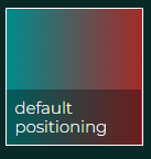
We can provide the percentage value explicitly. Or we can adjust. 25% would shift the mixing to the left, and 75% to the right.
<div style="background: linear-gradient(to right, darkcyan, 50%, brown)"><span>positioning 50%</span></div>
<div style="background: linear-gradient(to right, darkcyan, 25%, brown)"><span>positioning 25%</span></div>
<div style="background: linear-gradient(to right, darkcyan, 75%, brown)"><span>positioning 75%</span></div>
We can create a gradient between more than two colors. Let’s add cyan in between the two existing ones. By default the middle color is put right in the middle, at 50%. But we can adjust, so here it is at 25%. Or 75%.
<div style="background: linear-gradient(to right, black, cyan, darkcyan)"><span>more colors</span></div>
<div style="background: linear-gradient(to right, black, cyan 25%, darkcyan)"><span>positioning middle color (25%)</span></div>
<div style="background: linear-gradient(to right, black, cyan 75%, darkcyan)"><span>positioning middle color (75%)</span></div>
We can use this feature to control how wide each stripe is, and how soft or sharp is the transition from one color to another.
<div style="background: linear-gradient(to right, black 33%, black 33%, cyan 33%, cyan 67%, darkcyan 67%, darkcyan 100%)"><span>positioning each color</span></div>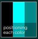
Transparency in Linear Gradients in CSS
We can also create a gradient from a color to a transparency. Or we can use hexadecimal values for even more ALPHA channel control.
<div style="background: linear-gradient(0deg, red, transparent);"><span>transparency</span></div>
<div style="background: linear-gradient(0deg, #FF0000AA, #FF000000);"><span>transparency</span></div>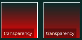
Finally, we can use the CSS3 background layers feature to overlay one gradient over the other. Here I will set three gradients – red, green and blue. The red will start at 0degrees, the green at 120 degrees and blue at 240 degrees.
With these particular degree values, we can achieve similar effect by using sides and corners instead of numbers.
<div style="background:
                linear-gradient(0deg, #FF0000AA, #FF000000),
                linear-gradient(120deg, #00FF00AA, #00FF0000),
                linear-gradient(240deg, #0000FFAA, #0000FF00)
"><span>layers (deg)</span></div>

<div style="background:
                linear-gradient(to top, #FF0000AA, #FF000000),
                linear-gradient(to top right, #00FF00AA, #00FF0000),
                linear-gradient(to top left, #0000FFAA, #00FF0000)
"><span>layers (sides)</span></div>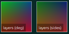
Linear Gradient over Background Image for Mist Effect
And finally something really amazing. We can use put a gradient layer on top of an existing image background. Here let’s add a mist over this mountainy photoshoot.
<div style="background:
                linear-gradient(to bottom, mistyrose, transparent),
                url('https://images.pexels.com/photos/2416864/pexels-photo-2416864.jpeg?auto=compress&cs=tinysrgb&w=600');
            background-size: cover;
"><span>mist effect</span></div>

<div style="background:
                url('https://images.pexels.com/photos/2416864/pexels-photo-2416864.jpeg?auto=compress&cs=tinysrgb&w=600');
            background-size: cover;
"><span>no mist effect</span></div>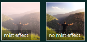
Repeating Linear Gradient – Gradient Background CSS Patterns
We can use repeating-linear-gradient() CSS function to obtain repeating patterns of CSS linear gradients.
<div style="background: linear-gradient(to right, black, darkcyan 10px, black 20px)"><span>single stripe</span></div>
<div style="background: repeating-linear-gradient(to right, black, darkcyan 10px, black 20px)"><span>repeated (px)</span></div>
<div style="background: repeating-linear-gradient(to right, black, darkcyan 10%, black 20%)"><span>repeated (%)</span></div>
<div style="background: repeating-linear-gradient(to right, black, black 10%, darkcyan 10%, darkcyan 20%)"><span>repeated (sharp)</span></div>
Summary
In this post I showed you multiple ideas how to use CSS linear gradients. I hope that will help you create custom CSS gradient backgrounds. I encourage you to check out the Youtube video of CSS Linear Gradient | CSS Gradient | linear-gradient(). In the video I show you all the ideas above in detail, and also show you how to use linear gradient & font-awesome icon to create a logo!

If you’d like to learn more on HTML, CSS and LESS in a structured, no-nonsense, hands-on manner, try my Udemy HTML & CSS 2022: Hands-on No-nonsense Guide!


Leave a Reply