


Conic gradient created with conic-gradient() function is an interesting alternative to CSS linear gradients and CSS radial gradients. In this post I will show you multiple ideas how to use CSS conic gradient and create gradient background CSS.
Youtube Video – CSS Radial / Conic Gradient
Demo and code (tl;dr)
See the Pen CSS Linear Gradient | linear-gradient() by Artur Karczmarczyk (@arturkarczmarczyk) on CodePen.
How to Use CSS Conic Gradients?
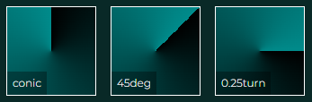
As an alternative to using radial gradients, which radiate from the center point, you can use conic gradients. By default they start at the top, and then build your gradient by rotating clockwise around the center point.
<div style="background: conic-gradient(black, darkcyan)"><span>conic</span></div>
<div style="background: conic-gradient(from 45deg, black, darkcyan)"><span>45deg</span></div>
<div style="background: conic-gradient(from 0.25turn, black, darkcyan)"><span>0.25turn</span></div>
Effect:
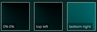
We can modify the position of the center point.
<div style="background: conic-gradient(from 0.25turn at 0% 0%, black, darkcyan)"><span>0% 0%</span></div>
<div style="background: conic-gradient(from 0.25turn at top left, black, darkcyan)"><span>top left</span></div>
<div style="background: conic-gradient(from 0.25turn at bottom right, black, darkcyan)"><span>bottom right</span></div>
This has produced a really interesting effect, where the center of the conical gradient is not visible, and only a quarter of it can be seen, so it is not really clear if it is linear, radial or conic:
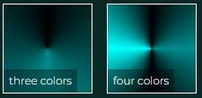
Of course if needed, we can provide more colors to our conic gradient.
<div style="background: conic-gradient(black, darkcyan, black)"><span>three colors</span></div>
<div style="background: conic-gradient(black, darkcyan, black, cyan, black)"><span>four colors</span></div>
Note that I am starting and ending with black color. This way I get rid of the sharp line in CSS conic gradient:
Summary
In this post I showed you multiple ideas how to use CSS conic gradients. I hope that it will help you create custom CSS gradient backgrounds. I encourage you to check out the Youtube video of CSS radial & conic gradients. In the video I show you all the ideas above in detail, and also show you how to use radial gradient & font-awesome icon to create a logo!

If you’d like to learn more on HTML, CSS and LESS in a structured, no-nonsense, hands-on manner, try my Udemy HTML & CSS 2022: Hands-on No-nonsense Guide!
Leave a Reply