

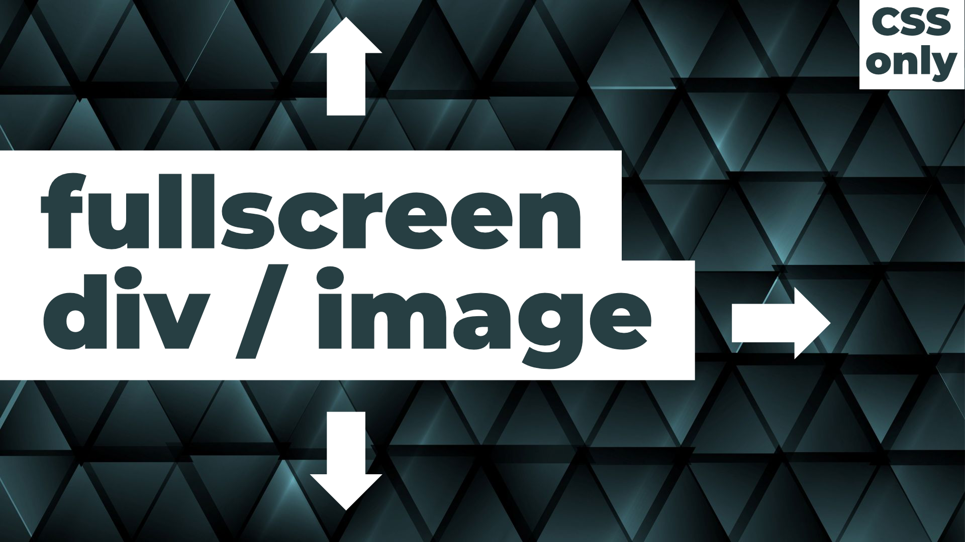
I’ve been in that place multiple times. I wanted a div to be full-screen, to cover the complete viewport. That’s simple: width: 100% and height: 100%. And what? And I kept getting those nasty scrollbars. In this post I will show you three ideas how to make image full-screen in HTML CSS. This can be a background image or a simple div or section, or maybe an overlay.
Youtube Video – How to Make Image Full Screen in HTML CSS
Demo and code (tl;dr)
See the Pen How to Make Image Full-Screen in HTML CSS – How to center Vertically and Horizontally by Artur Karczmarczyk (@arturkarczmarczyk) on CodePen.
How to Make Div Full-Screen in CSS – Approach 1 (height: 100%)
Let’s jump right into the code and start with our initial HTML:
<body>
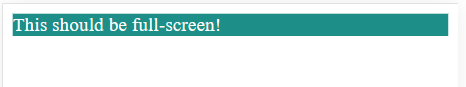
<div class="full-body">This should be full-screen!</div>
</body>The HTML here is really simple, all we have is a div with a full-body class.
My most basic idea is to simply set the block width and height to 100%. However, blocks are 100% by default, so all we need to set is the height:
.full-body {
  background-color: #1E8E88;
  color: white;
  height: 100%;
}
Note, I set the background color of the div to #1E8E88 to be able to distinguish it from the background. Done? Not really:
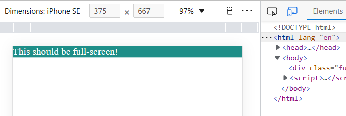
There are two issues:
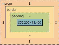
- The block has the height of a single line only;
- The block has margins on all sides.
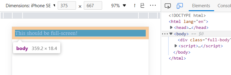
The browser dev tools can help us understand why:
So let’s update our styling:
.full-body {
  background-color: #1E8E88;
  color: white;
  height: 100%;
}

body {
  height: 100%;
  margin: 0;
}
Better, but still not it:
html element to make a div full-screen with CSS.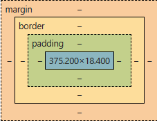
html element has limited height so 100% of body is still a single line and div is not 100% height of the screen.The body is 100% high… but 100% high of the HTML, which is only 18px high. So let’s add styling of html as well:
.full-body {
background-color: #1E8E88;
color: white;
height: 100%;
}
body {
height: 100%;
margin: 0;
}
html {
height: 100%;
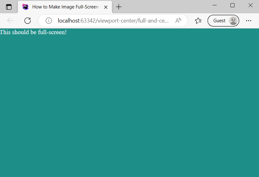
}And it’s done!
How to make background image full-screen in HTML – Approach 2 (height: 100vh; width: 100vw)
Let’s scratch out all CSS that we had and start again, this time with height: 100vh and width: 100vw:
.full-body {
  background-color: #1E8E88;
  color: white;
  height: 100vh;
  width: 100vw;
}
And here they are, those nasty scrollbars:
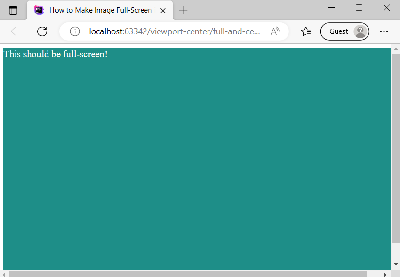
div height is set to 100% to make the div full-screen in HTML.Why? That’s simple, the body has 8px margins everywhere again. Let’s remove them:
.full-body {
background-color: #1E8E88;
color: white;
height: 100vh;
width: 100vw;
}
body {
margin: 0;
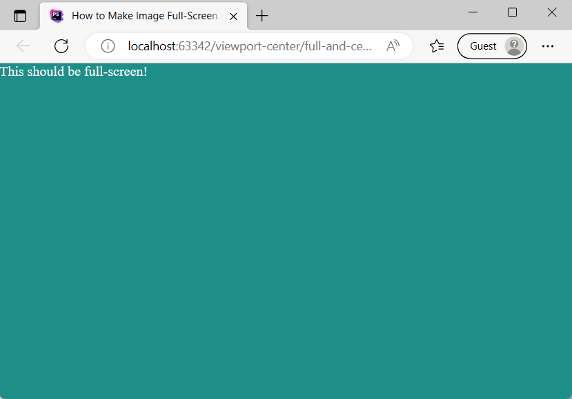
}And tadaaam, our div is taking 100% of the viewport now and there are no scrollbars:
CSS Background Image Full Screen – Approach 3 – CSS Overlay
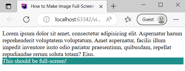
In the third approach we will modify the HTML slightly to add some text. We will want our div to be a full-screen overlay:
<body>
  Lorem ipsum dolor sit amet, consectetur adipisicing elit. Aspernatur harum reprehenderit voluptatem voluptatum. Amet aspernatur, facilis illum impedit inventore iusto odio pariatur praesentium, quibusdam, repellat repudiandae rerum soluta totam? Eius.
  <div class="full-body">This should be full-screen!</div>
</body>
And here’s the basic CSS for distinguishing the overlay div from the rest of the text:
.full-body {
  background-color: #1E8E88;
  color: white;
}
Nothing special so far:
In this approach we will use the old-school position: absolute and we will set the top, right, bottom and left coordinates to 0. I’m going to also set the alpha channel for the background-color, so we can see the text below the CSS div overlay:
.full-body {
  background-color: #1E8E88CC;
  color: white;

  position: absolute;
  top: 0;
  right: 0;
  bottom: 0;
  left: 0;
}
And here’s our result:
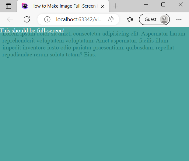
Image Background Div
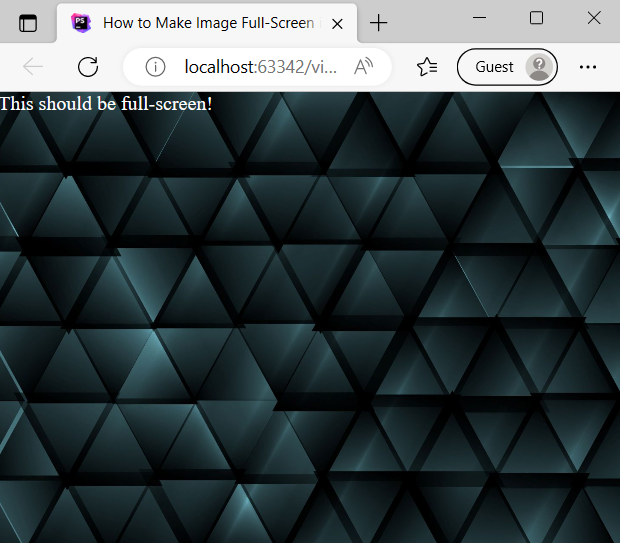
In all the above sections I promised making image full-screen in HTML CSS, but there weren’t really images so far. So let’s modify the last approach and instead of a solid color, let’s put there an image:
.full-body {
  background-image: url("triangles.jpg");
  background-size: cover;
  color: white;

  position: absolute;
  top: 0;
  right: 0;
  bottom: 0;
  left: 0;
}
What changed there is actually instead of a solid color, now we have an image as background image. I like to take my images from Envato Elements, but Unsplash, Pexels, Pixabay etc are good as well!
In order to show as much of the image as possible, looking good on all screen sizes and keeping aspect ratio, I’m also using backgorund-size: cover. Let’s also remove the Lorem Ipsum text. And here’s the final outcome:
Summary
In this web dev idea I showed you how to make block or image image full-screen in HTML CSS. I encourage you to check out the Youtube video of How to Make Image Full Screen in HTML CSS.
If you’d like to learn more on HTML, CSS and LESS in a structured, no-nonsense, hands-on manner, try my Udemy HTML & CSS 2022: Hands-on No-nonsense Guide!
Leave a Reply