

CSS radial-gradient() and repeating-radial-gradient() functions allow to compute amazing radial gradients without need to use external graphics software. In this post I will show you multiple ideas how to use CSS radial gradient, CSS conic gradient and create gradient background CSS.
Youtube Video – CSS Radial / Conic Gradient
Demo and code (tl;dr)
See the Pen CSS Linear Gradient | linear-gradient() by Artur Karczmarczyk (@arturkarczmarczyk) on CodePen.
CSS radial-gradient() basic usage
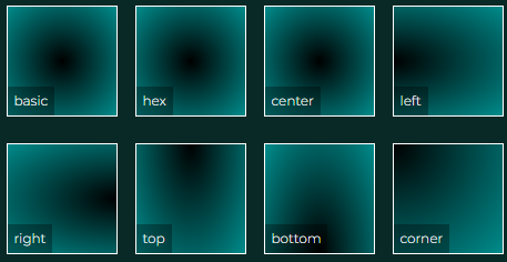
Let’s jump right into the code. To create a basic radial gradient, simply use radial-gradient function and provide two colors. Here I am using the color names, but you can use everything that is available for colors, so you can use hexadecimal values or RGB etc.
<div style="background: radial-gradient(black, darkcyan)"><span>basic</span></div>As the first parameter, we can provide the position of the center of the gradient. By default it is center. Other possibilities include top, right, left and bottom for sides and a mix of those for corners.
<div style="background: radial-gradient(at center, black, darkcyan)"><span>center</span></div>
<div style="background: radial-gradient(at left, black, darkcyan)"><span>left</span></div>
<div style="background: radial-gradient(at right, black, darkcyan)"><span>right</span></div>
<div style="background: radial-gradient(at top, black, darkcyan)"><span>top</span></div>
<div style="background: radial-gradient(at bottom, black, darkcyan)"><span>bottom</span></div>
<div style="background: radial-gradient(at top left, black, darkcyan)"><span>corner</span></div>
Effect:
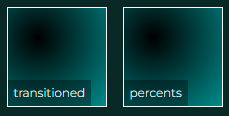
Next to each side name, we can provide the length, how much to move the center from it. You can go with pixels or percents:
<div style="background: radial-gradient(at top 30px left 30px, black, darkcyan)"><span>transitioned</span></div>
<div style="background: radial-gradient(at top 30% left 30%, black, darkcyan)"><span>percents</span></div>
Effect:
Adjusting CSS Radial Gradient Shape and Size
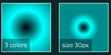
We can provide more colors if needed. The size of the gradient can also be adjusted:
<div style="background: radial-gradient(at top 30% left 30%, black, darkcyan)"><span>percents</span></div>
<div style="background: radial-gradient(at center, black, cyan, darkcyan)"><span>3 colors</span></div>
Effect:
The gradient size can also be set using keywords closest-side, closest-corner, farthest-side, farthest-corner. Defaults to farthest-corner.
<div style="width: 200px; background: radial-gradient(closest-side at center, black, cyan, darkcyan)"><span>closest-side</span></div>
<div style="width: 200px; background: radial-gradient(farthest-side at center, black, cyan, darkcyan)"><span>farthest-side</span></div>
<div style="width: 200px; background: radial-gradient(closest-corner at center, black, cyan, darkcyan)"><span>closest-corner</span></div>
<div style="width: 200px; background: radial-gradient(farthest-corner at center, black, cyan, darkcyan)"><span>farthest-corner</span></div>
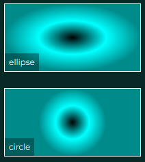
By default, the gradient has an ellipse shape, but we can change it to circle.
<div style="width: 200px; background: radial-gradient(ellipse closest-side at center, black, cyan, darkcyan)"><span>ellipse</span></div>
<div style="width: 200px; background: radial-gradient(circle closest-side at center, black, cyan, darkcyan)"><span>circle</span></div>
Effect:
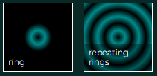
We can specify the stops for each color, to obtain for example a kind of ring. If we wanted the gradient to repeat, we can do that easily by changing the gradient function to repeating one:
<div style="background: radial-gradient(black, darkcyan 10px, black 20px)"><span>ring</span></div>
<div style="background: repeating-radial-gradient(black, darkcyan 10px, black 20px)"><span>repeating rings</span></div>
Effect:
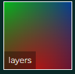
Finally, let’s use the background image layers feature to put three partially transparent radial gradients on top of each other.
<div style="background:
                radial-gradient(circle at bottom, #FF0000AA, transparent),
                radial-gradient(circle at top left, #00FF00AA, transparent),
                radial-gradient(circle at top right, #0000FFAA, transparent)
;"><span>layers</span></div>
Effect:
Summary
In this post I showed you multiple ideas how to use CSS radial gradients. I hope that it will help you create custom CSS gradient backgrounds. I encourage you to check out the Youtube video of CSS radial & conic gradients. In the video I show you all the ideas above in detail, and also show you how to use radial gradient & font-awesome icon to create a logo!

If you’d like to learn more on HTML, CSS and LESS in a structured, no-nonsense, hands-on manner, try my Udemy HTML & CSS 2022: Hands-on No-nonsense Guide!
Leave a Reply