

Pinterest-like layout, sometimes also referred to as Masonry-like layout, is an interesting alternative to the standard Bootstrap 12-column layout. In this layout images or other elements of various sizes are stacked one below another in multiple equal-width columns. There are a bunch of possibilities how to achieve such layout, and we are exploring them in this challenge. In this web dev idea we are going to build a css-only Pinterest-like layout with CSS “columns” property, without using any JS.
Youtube Video – Pinterest Layout with CSS only
Demo and code (tl;dr)
See the Pen Pinterest-like Layout Using CSS “columns” by Artur Karczmarczyk (@arturkarczmarczyk) on CodePen.
How to Create Pinterest-like Layout with CSS only?
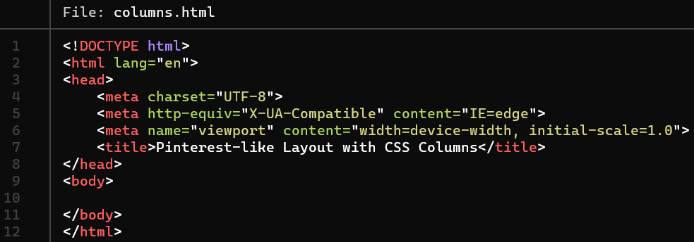
Let’s start by creating an empty HTML file:
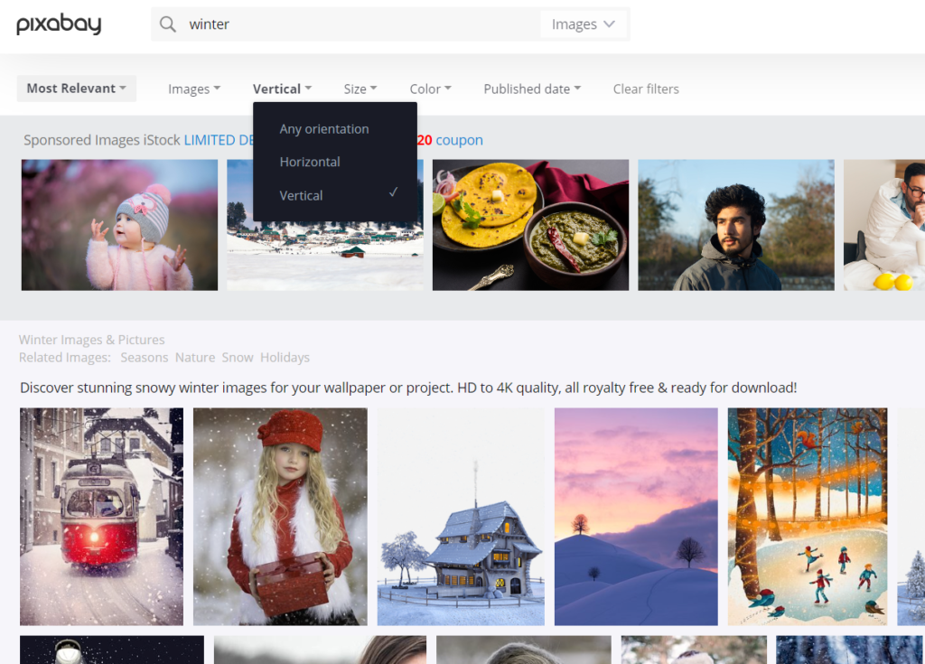
We will need some pictures. You can downlaod them freely from https://pixabay.com/. When you type the search term, on the search results page you can choose the image orientation. We need both horizontal and vertical images:
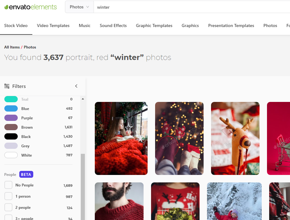
Alternatively, for your real-life projects you can use Envato Elements, which is a subscription-based platform offering millions of stock photos, graphics, videos at a single monthly subscription fee:
Once you have the images downloaded, you can add them to your HTML. I suggest wrapping everything into a <main> container:
<main> and images <img> added to the Pinterest-like CSS-only layout HTML template.Styling the Pinterest-like layout in LESS/CSS
Once the HTML is complete, we can add some styling:
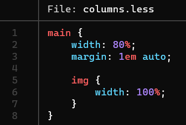
I am using LESS, but you can easily build it in pure CSS as well!
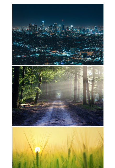
Once the styling is added, you can preview the output:
Now that we have the images ready, and some basic styling in place as well, we can use the columns CSS property to specify the width of the columns. You can provide there either a fixed count (for example 3, and then use @media queries to adjust the count for various screen sizes) or a fixed width of a column. I’ve decided to go with the latter, so my Pinterest layout column count will adjust automatically to fill 80% of the viewport width:
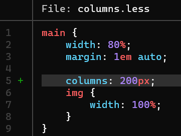


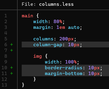
Eventually some roudning and spacing need to be added:
And here’s the result:
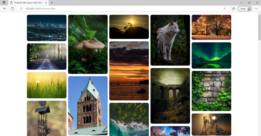
columns CSS property.Summary
In this web dev idea I showed you how you can easily obtain a Pinterest-like Masonry-like stacked-images layout with the use of a simple columns CSS property. This layout is a refreshing alternative compared to the traditional Bootstrap-based column layout.
I encourage you to check out the Youtube video of this CSS Pinterest layout web dev idea!
If you’d like to learn more on HTML, CSS and LESS in a structured, no-nonsense, hands-on manner, try my Udemy course!
Leave a Reply