

Hello and welcome! The best way to learn web development is through challenges. In this challenge we want to build a Pinterest-like layout using HTML & CSS.
This is how it looks on Pinterest:
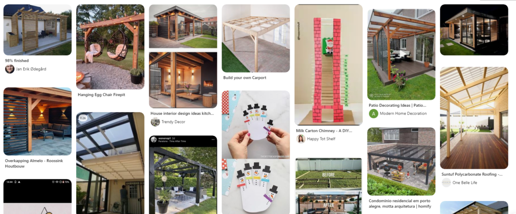
As you can see, the Pinterest-like layout contains a grid of ractangular images with rounded borders. Majority of the images are vertical. The images have various heights, but the screen is generally fully filled with content.
When the screen gets narrower, the images should drop to next lines, possibly reorder. And possibly the images transition should be animated on window resize.
Possible Solutions for Pinterest-like CSS Layout
Right now I have a few ideas!
- The first idea is to use traditional
display: inline-blocklayout withfloat: lefton all images. This might or might not work though! - Another idea is to use
display: gridand see what happens! Probably we will need to set thegrid-template-columnswith various count of columns for various screen sizes and then set the image width to 100%. Will that work? Will it fill the blank spaces? Will it be possible to animate transitions? We will see!
Accepted solution
Hurray! There is a solution for this Challenge already. See this post for a CSS-only approach with columns CSS property.
Leave a Reply